Libby App
UX/UII redesigned an app I use very often called the Libby app which is a digital library platform that, with a library card, connects you to that library’s ebook, audiobook, and magazine collections. I began by interviewing people that use the app and combined those results with my own issues with the app design. From this research I identified the problems I wanted to tackle which are: information hierarchy, legibility, and ease of use and app navigation.


Explore page redesign
To address the navigation bar issues I labeled all the icons on the nav bar and moved the settings icon to the far right so it could sit in a more intuitive position. I also chose to combine the search and library pages to create one single explore page so you can search for new books as well as get recommendations in the same place. Next I used the libby blue and pink along with a range of neutral blacks and whites to increase legibility. I also added a light and dark mode toggle button for quick access so make the app more versatile when going from light and dark areas throughout the day.
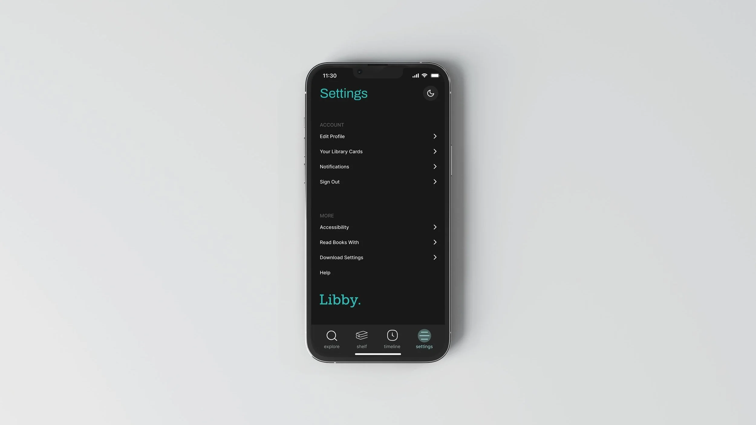
original designSettings page redesign
I created a uniform layout with minimal typography colors to make the settings much easier to navigate. Throughout this process I was constantly testing my wireframes and designs with my classmates and friends to make sure I was solving the problems correctly to come up with this final design.
original designnew explore page designnew design